
Tree Equity Score Map UI Redesign
UX/UI Design · Cartography · Data Viz · Typescript/TailwindCSS
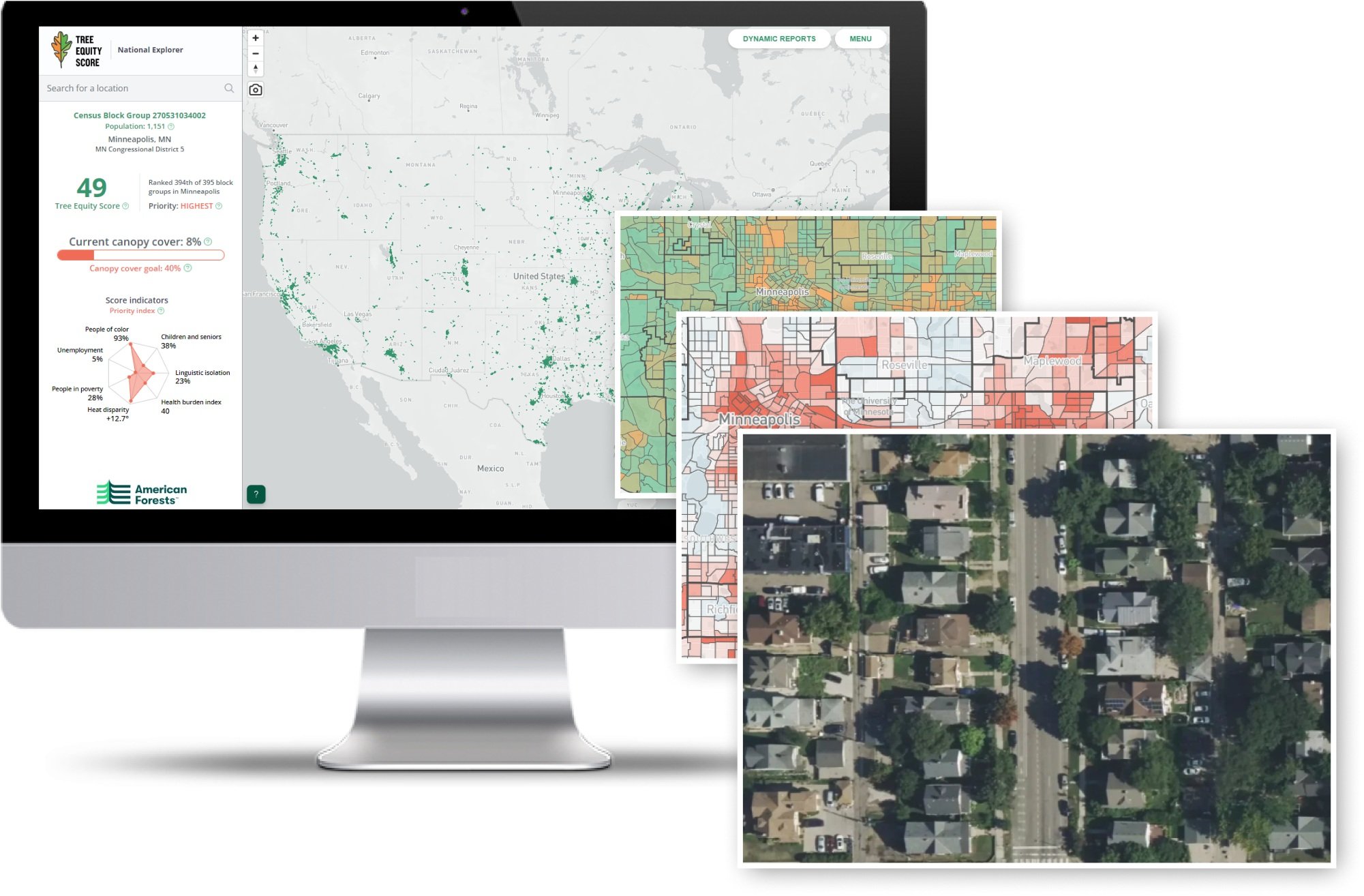
The central map user interface (UI) in American Forests’ Tree Equity Score applications required an update to level it up as its national audience grows. I applied more deliberate use of contrast in customized ramps for each map variable, testing for maximal contrast across many different U.S. cities and regions and for accessibility for low-vision users. The legacy map was employing a problematic skin tone color ramp for several variables, including 'people of color.’ Darker browns were associated with negative outcomes like health burden, unemployment, and poverty. I replaced this ramp with a more neutral blue. I added hierarchy to the information displayed in the map sidebar, reorganizing elements to help users more easily find the information they are most interested in. Tree Equity Score provided summary reports at different geographic scales—but access to the different scales was scattered in the map UI, making it difficult for users to understand all their options. We created a consolidated menu that pops up and updates as users click around the map.
Coming soon: Website Redesign and Reports Redesign for Tree Equity Score.

